Whether you are building your author website for the first time or need a refresher, this is a must read!
As an author, it’s important to have a website that represents you and your work. Your website should represent who you are as an author and what you want to say, but should also give information about your books and where readers can find you. Here are the essentials every author website should have.
- Include a list of your published work (books, novels, eBooks, articles etc)
- Shows upcoming and new releases
- Have a separate page about you
- Provide a way to contact you.
- Include links to your social media accounts.
lindatharpink.com
Linda Tharp’s website is the best example of a minimal author’s website. Unlike other writers’ websites, Linda’s website shows the author’s bio before going into book links. The landing page is composed of a still image with the author’s names, and then we see the author’s bio and in the end, we see her works. This type of author website is best for authors who have published more than one book and want to increase their fan base.
 What they did well:
- She utilizes an attractive background.
- The minimalist design keeps the user focused on the imagery and tab options.
- Website upload speed is quick, allowing for ease of use. (the image speed is different)
- Author name is the central focus of the page driving her brand.
- Her bio adds to the focus of her branding.
- The focus lies on the author and not the books.
- Upcoming works are included leaving the reader in anticipation of the next book.
- Blog section is included allowing for media integration.
- Social media is included at the bottom of the website.
- Along with social media is a contact me section located in the same area.
What to consider changing:
- The format is best for authors: more than one book published and established fans.
- Books published are limited in their appearance on the site.
- If a new author, not having books advertised can be hurtful to your branding.
- There’s no link to buy books on Amazon or other book stores.
- Blog isn’t up-to-date.
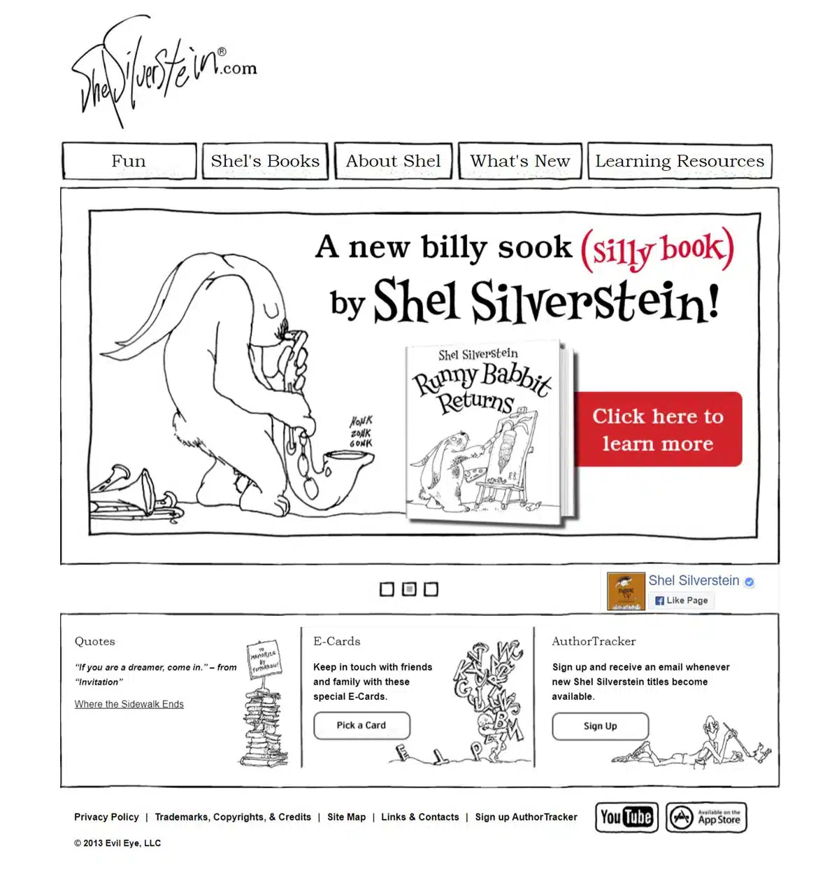
shelsilverstein.com
What they did well:
- The design according to book types plays in favor of the author’s theme.
- Library editions and hardcovers available on Amazon, Barnes & Noble, and Walmart.
- Image gallery on about page enhances the appearance.
What to consider changing:
- Logo could be at the center of the header on the desktop version.
- No contact form nor social media links on the site. (The author died many years ago though.)
- CTA buttons should be in red as this draws the focus.
- Book reviews can be added to the books pages.
annvoskamp.com
What they did well:
- Theme of the author is conveyed.
- Background provides a feeling of this being an author’s website.
- Promotes current work and upcoming books.
- Interactive tabs for short reading material/blog posts to pull in new audiences.
- Seamless and fluid transitions from one section of the website to the next.
What to consider changing:
- Author bio could include a bit more information about the genre of writing.
- Images start to blend together, it could use fragmentation for easier reading and interpretation.
To read the Original Article click here


 What they did well:


0 Comments