

Typography of Children’s Books
Most of us can recall at least one or two of our favorite childhood storybooks (or at least their covers!) They provided us with a unique adventure of a lifetime, every time we dived in. We could become our own heroes, princesses, family of bears; Even inanimate objects came to life!
What we didn’t realize at the time is that those books were our first taste of design, typography and illustration. The power a serif adds to a font slid past our conscience and took us to wild parts of our imagination – to timeless scenes of romance and mystery. Whereas a serif font read cleaner and straighter. Titles that were hand drawn expressed different emotions and connect us to their stories, even today!
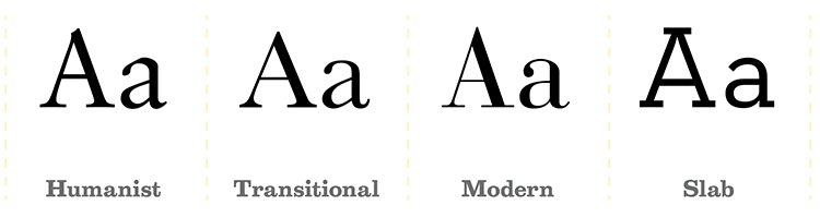
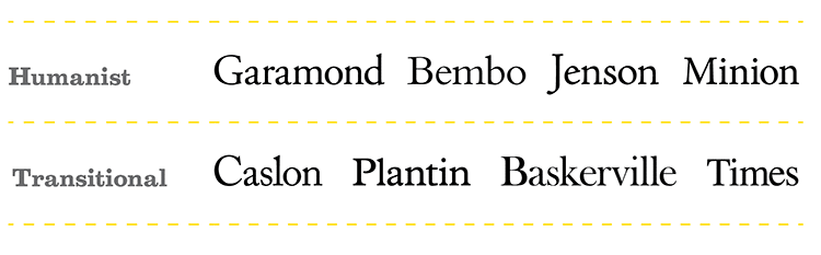
In the 70’s, most classic children’s books were typeset in large typefaces from the classifications Humanist Serif (or Old Style) and Transitional Serif. Both serif styles differ in stroke and contrast, but they were equally used in children’s books for their legibility.
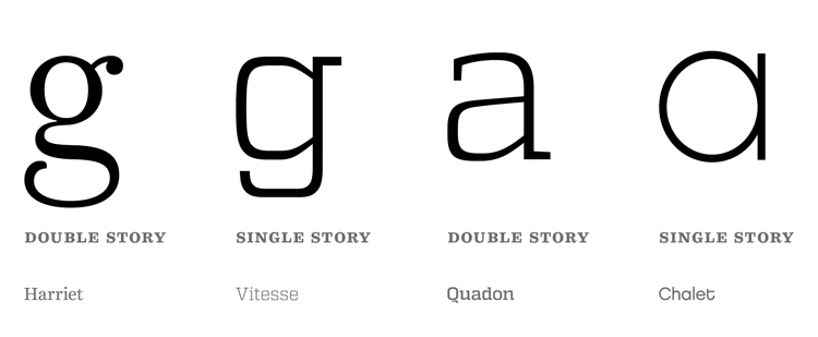
Allographs are considered variants of a letter. The lowercase versions of letter g and letter a have two types of variants. The one we learned how to write in grade school penmanship is single-story. The alternative is double story. The double-story variants are easier to read because there’s more visual indicators in the letterform.
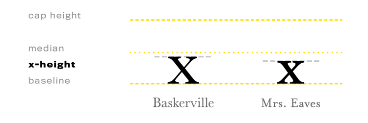
The x-height of a character refers to the visual size of the typestyle, not the point size. Compare the heights of the lowercase ‘x’ from a Humanist Serif to another typeface, and that will give you an idea of how ‘large’ and legible it is. Both of these are Transitional Serifs, but Baskerville is easier to read than Mrs. Eaves, because of its high x-height
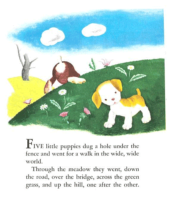
Early readers love Little Golden Books. One of the originals, The Poky Little Puppy by Janette Sebring Lowrey (1942) is also set in a Humanist typeface, Garamond.
Now you know! So, pull out your old books, take a look inside, and walk through memory lane with a new lens. You’ll notice most of the classics were set in serif. More recent children’s books, depending on their concept, might be set in sans serif. Either way, they probably have large x-heights, wide characters, and two-story allographs to keep kids reading!


0 Comments